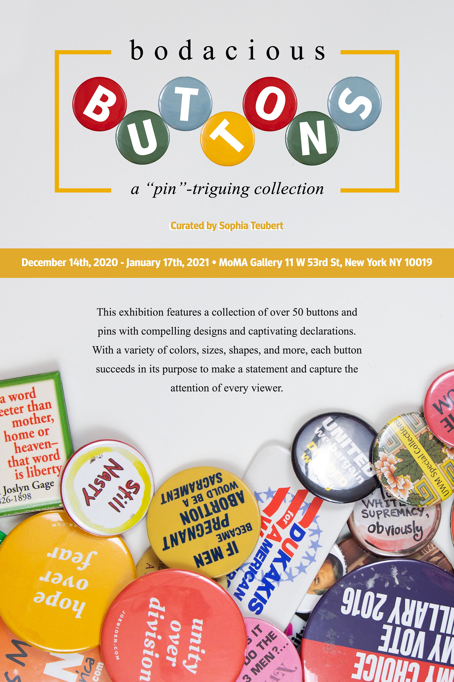
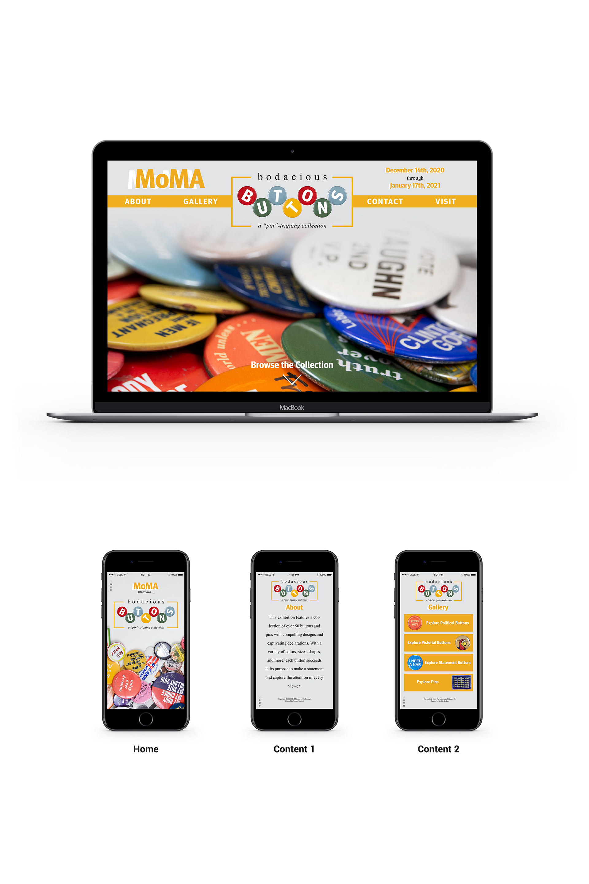
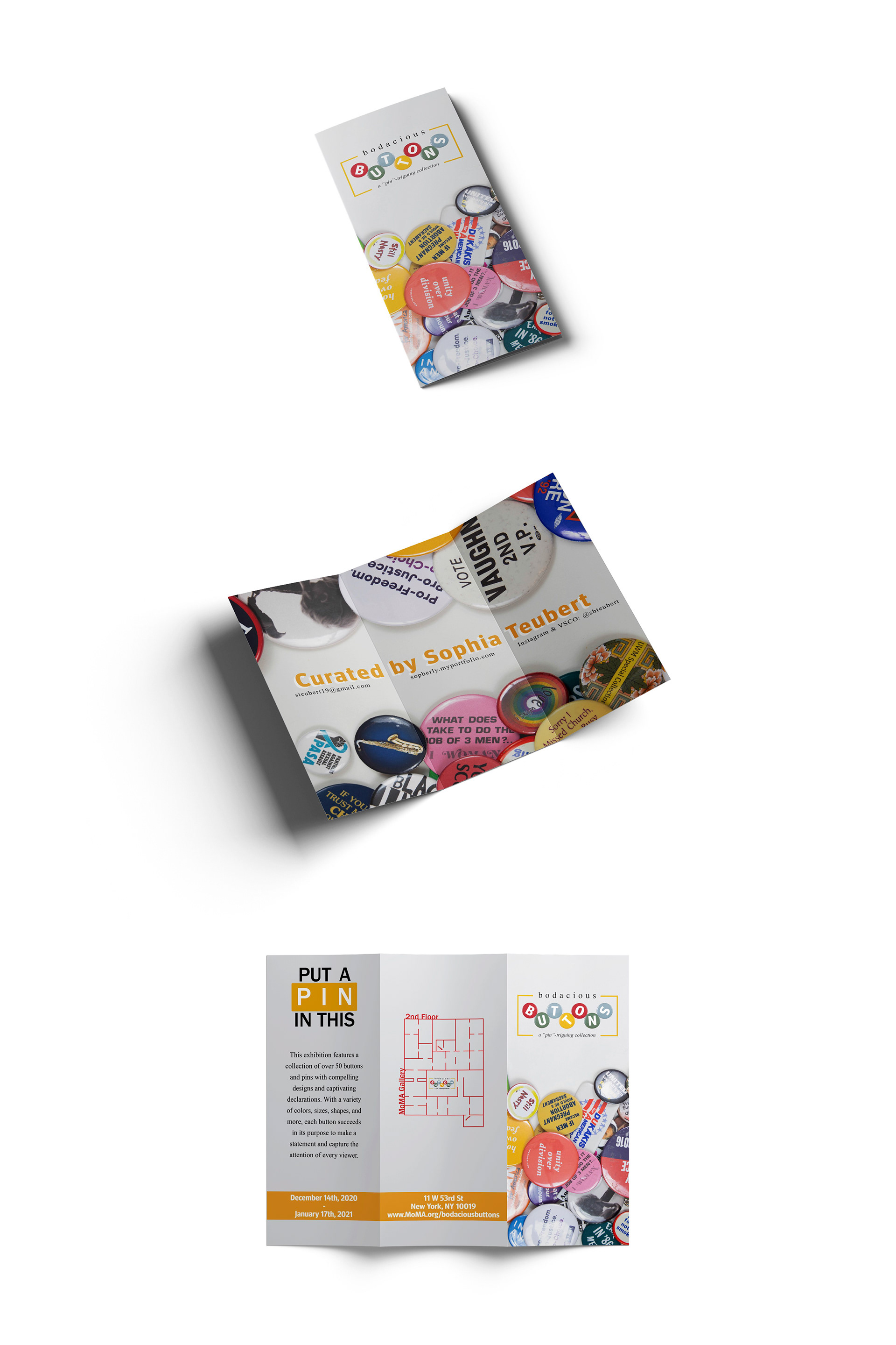
_Bodacious Buttons_, Digital, 12" x 18", 2020
Objective: Find a collection and create different media/advertisements for an exhibition about that collection. Specifically a poster, brochure, and website page.
Rationale: I chose to represent my extensive button pin collection. I wanted to choose a simple background with vibrant accent colors to go along with the vibrant colors of the different buttons. I also utilized grids and guides in InDesign to come up with detailed and effective layouts, as that is an important aspect of the design process.
~

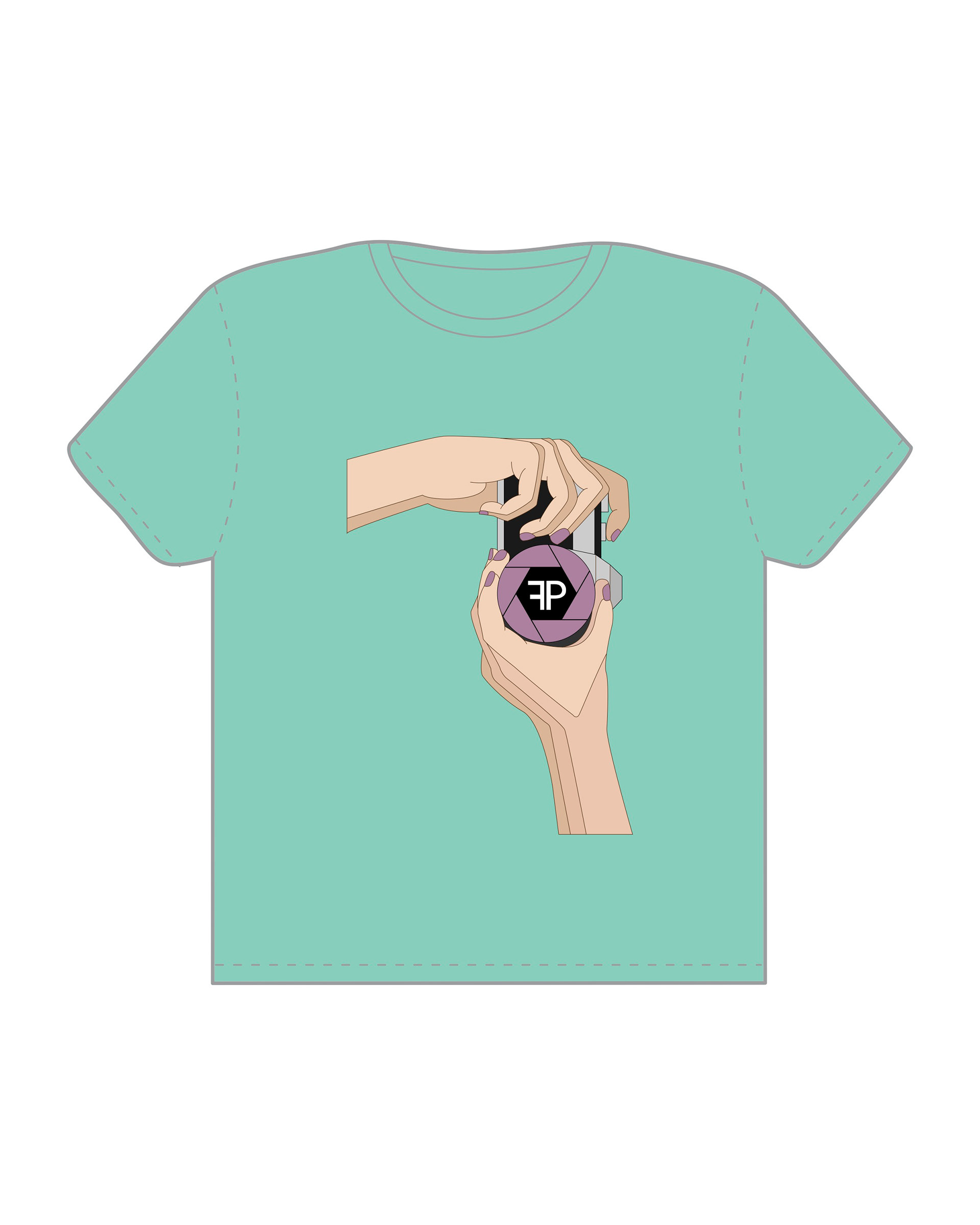

_Focus Photography Club_, Digital, 8" x 10", 2020
Objective: Choose a cause/organization that you are interested in and create a t-shirt design for that company, organization, and/or cause. The design must be original imagery without the use of text.
Rationale: I chose to represent the Focus Photography Club at UWM. As the current president of the club, I wanted to bring awareness to it in the hopes of gaining new members and building a community of photographers at UWM.
~
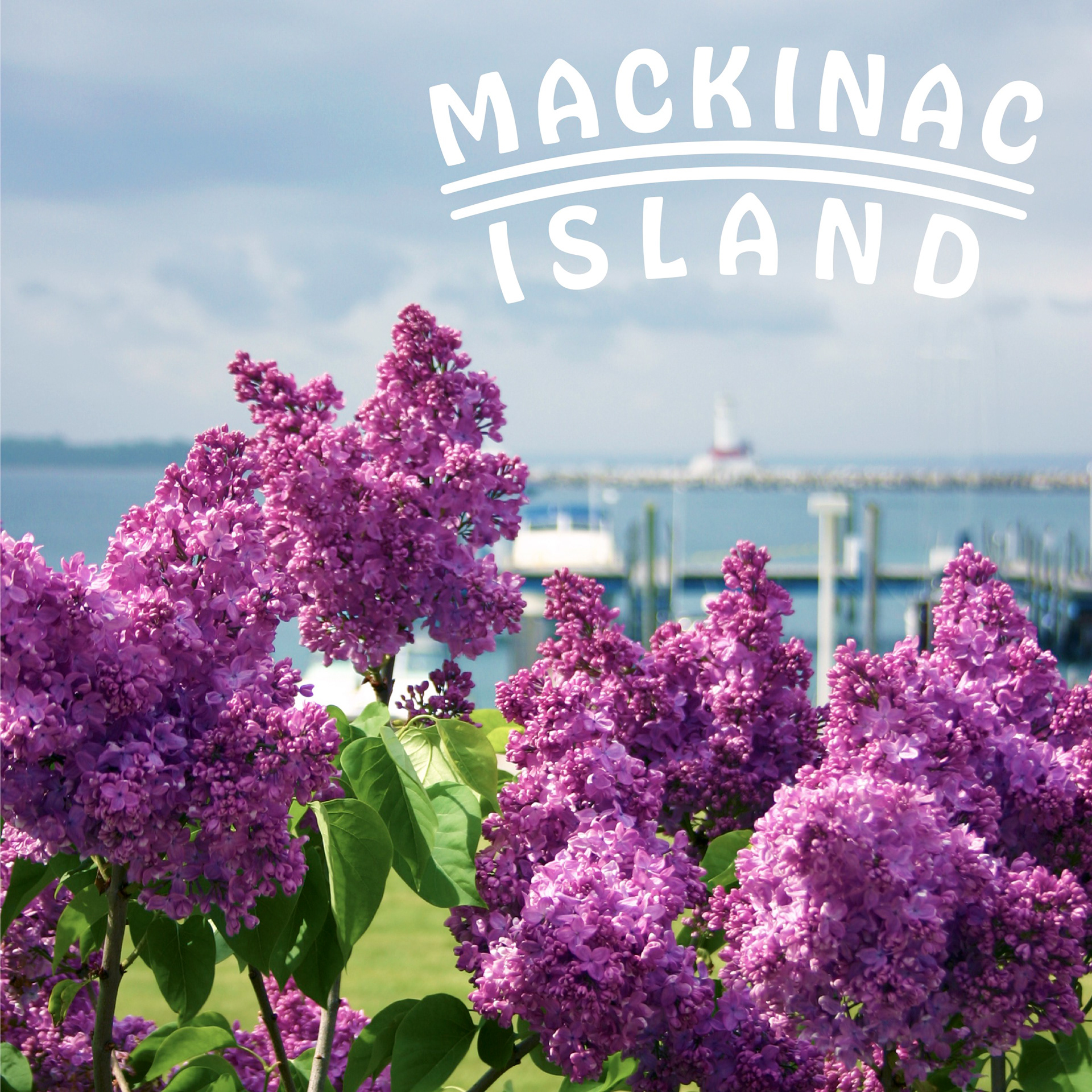
_Mackinac Island_, Digital, 5" x 5", 2021
Objective: The identity of a city is extremely important and is what differs itself from other locations. One way to explain what makes a specific city so unique is through design. Specific wordmarks can allow the viewer to understand what the city is like. Create a typographic metaphor for the specific city assigned.
Rationale: We were assigned partners to act as our clients for this project. My partner chose Mackinac Island, Michigan for me to design a wordmark for. While interviewing her and gathering research for the city, I found that one of its iconic attractions is the various lilacs spread around the island, as well as the annual lilac festival that is held. From there, I created a wordmark that represented the history of the island as well as the elegance of the floral scenery the island possesses.
~
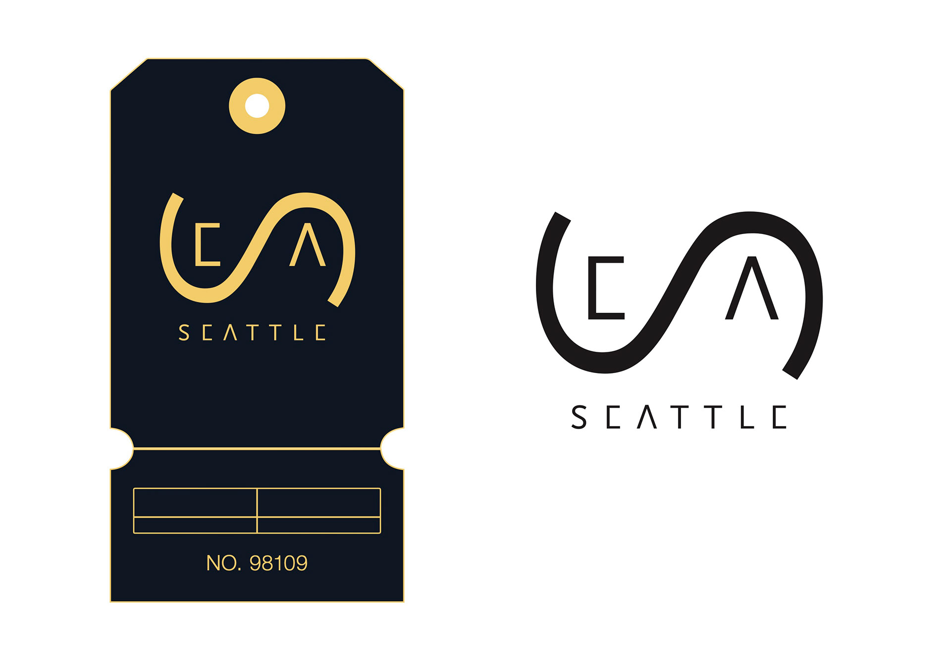
_Seattle-Tacoma International Airport Wordmark_, Digital, 8" x 10", 2021
Objective: Choose a specific airport from anywhere in the world and create a new design for the name of the airport. After researching and gathering information, recreate the three letters that represent your chosen airport. Typefaces, fonts, distortions, and even colors all play a role in the representation of the airport.
Rationale: I chose to create a wordmark for the Seattle-Tacoma International Airport. I used color to represent the history of the city and subtractive elements in the lettering to represent its modern architecture. The organic flow of the "s" represents the city's close proximity to the ocean.
~
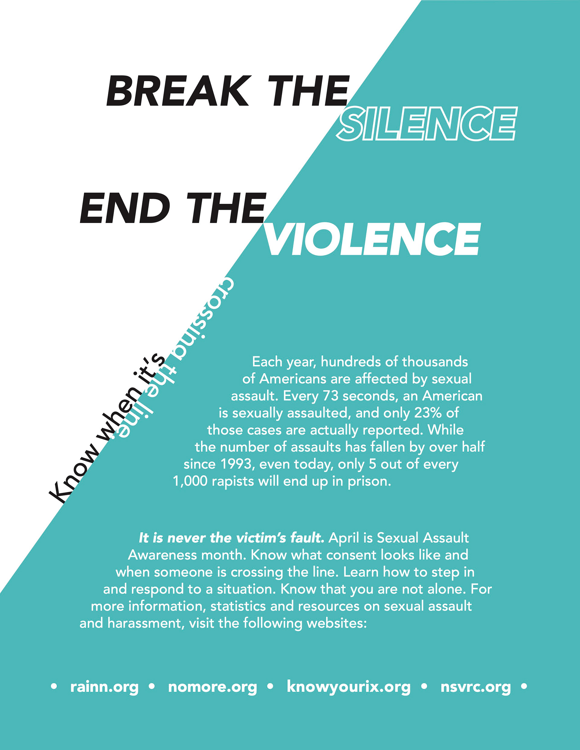

_Break the Silence, End the Violence_, Digital, 8" x 10", 2021
Objective: Choose a cause and create a typographic Public Service Announcement poster regarding the chosen topic.
Rationale: I wanted to represent sexual assault awareness for my typographic poster. I used grids and guides to develop the layout of the poster and button. I chose to use teal, the associated color with sexual assault awareness, as the dominant color in the poster, along with black and white, to keep it simple and straightforward.
~
_Cookbook Spreads_, Digital, 8" x 5", 2021
Objective: Create a structured and visually aesthetic cookbook spread. Include all information given and keep in mind the importance of grid systems to establish organization and legibility.
Rationale: While considering the importance of grids and layouts to composition, I wanted to create a comprehensive theme between the spreads of my two assigned recipes. After doing some research upon receiving my recipes, I chose the theme "savory and zesty" and built a composition around those two words, focusing on visual elements, consistent layouts, and hierarchy.